


Design Role
・UX Researcher ・UX Designer・UI Designer

Duration & Tools
・4 Weeks ・Figma・Google Workspace
Part 1: Overview
What is Bus Buddy?
With all the different routes and times being added and changed, it can be difficult to figure out which bus to take and what is the fastest way to get to your destination. This app provides you with bus information in a simple and intuitive way.
%201.png)
Reason to Design
The city has developed a way to know how far away each bus is from a stop, but they aren't sure how to share that information with riders. They want a new mobile app created to accommodate the new expansion on the bus system, encourage locals to use public transportation, and provide a more stress-free riding environment.

Audience
The audience is regular bus riders who use the bus to commute on a daily basis. The typical user has a regular schedule and rarely deviates from it.
The Problem
Due to expansion, numerous bus routes have been recently added. Many of those routes stop at the same bus stop. Riders want to know when the next bus will arrive at each stop. They also want to know how much time they have to get to the bus stop. Riders are currently complaining the most about the bus stop at Washington and State, which is served by seven bus lines.

Solution
To design a mobile app that displays important information for the Washington & State bus stop which includes the following:
-
Ensure that any rider can tell when each of the buses arrives at the Washington & State bus stop.
-
Ensure that all riders can tell how much time they have to get to the Washington & State bus stop before the bus they need arrives at that stop.
-
Allow riders to select one of seven bus lines to see a list of their future arrival times at the Washington & State bus stop.
Part 2: Research & Discovery

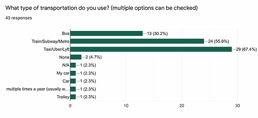
User Survey
In order to understand the needs of transportation users and to find out their motivations and dissatisfaction with the apps they currently use, we conducted a user survey. In this survey, 43 people answered.
-
How often do you use public transportation?
-
What type of transportation do you use?
-
What do you use public transportation for?
-
What public transportation app(s) have you used/are you using?
-
What feature of the app(s) do you like most?
-
What is your experience using public transportation app(s)?
-
What is your age group?

The 5 most important features:
-
Visual aides depicting location the bus is
-
Nearby public transport routes
-
Direction
-
Showing fares
-
Reminders/Push notifications

Competitive Analysis

Google Map
Strengths
-
Strong and clean brand recognition with a trustworthy impression
-
Ability to download maps for offline use
-
Customizable route options - avoid highways, tolls & ferries
Weaknesses
-
It does not allow you to identify the stop and see which bus will arrive when
-
Walking navigation directions are sometimes inaccurate (confusing)
Opportunities
-
Being a well-known and established brand requires no marketing or advertising efforts
Threats
-
User’s privacy and security issues when it comes to saving travel data or location sharing

Moovit
Strengths
-
Instantly provides service alerts for delays, unexpected disruptions, construction, etc
-
Provide clearer and self-explanatory steps for users to easily add locations or routes to their favorites list
Weaknesses
-
The frequent display of ads is disturbing
-
No business or location information is available
Opportunities
-
Providing business or location information may be an extra benefit for Moovit users
Threats
-
There are no additional integrations or features within Moovit which may cause users to utilize another app

Persona
Based on the survey and interviews I created the main persona and referred to him throughout the process to address the user's pain points.

Age 26 ・Data Analyst
Kevin Ferguson
Lives in New York
I want to know exactly where my bus is, so I don't waste time waiting for it!
About
Kevin recently became a data analyst and moved to the city.
Before moving, he sold his car and decided to use the city's public transportation. His new life is very exciting, but he is always stressed because he doesn't know if he can make it to work on time.
Needs
・Know his bus arrival time
・Be on time to work
・Find a reliable transportation app that provides real-time bus arrival times
Pain Points
・Inaccurate and unreliable bus times
・Being rushed to work due to delayed bus
・Complicated bus system
Part 3: Information Architecture

User Stories
Knowing the competitors and potential users in the market made it easier to create user stories. This step was done to identify and indicate the priority features of the app.
To create user stories, I concentrated on the features that the app should have based on the main concerns and findings from the survey. I work mainly on all the stories that I deemed “high priority”, but I also included 2 “medium priority stories” to come out with a well-rounded MVP.


User Flow
I created user flows to visualize the path a user would take through my interface to complete the high-priority tasks identified in my user stories. This helped me understand the kind of visual hierarchy I would need to design and how all the elements would relate together.
.png)

Site Map
After understanding the screens I would design from the user flows, I created a site map to organize my screens and layout the hierarchical structure of my app.
.png)

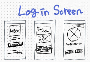
Sketches
I wanted to put into paper my first raw ideas and after some testing and iteration, change the design accordingly to the feedback that I would receive.
・Login Screen ・Home (Direction) ・Hamburger Menu ・Search ・Bus Stop ・Routes
.jpg)
.jpg)
.jpg)
%201.png)
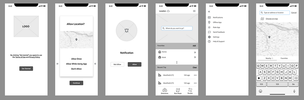
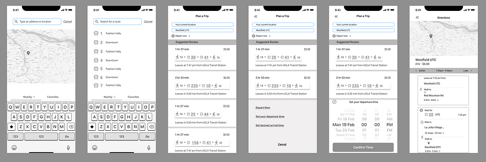
Low-Fidelity Wireframe
Using the user flow and my competitive analysis, I created low-fidelity wireframes. After developing and few iterations in the wireframe process, I settled on how I wanted the app to flow visually from the home page through the start navigation page.

Usability Testing
I received very helpful feedback from the test participants. They said that the interface was simple and clear. Despite the intuitive usability, test participants pointed out some design issues.
-
The “Allow Location” screen has an unnecessary CTA button
-
Need to adjust the suggested routes in the ”plan a trip” screen ( Sort by time or money)
-
Need to set the CTA buttons for departure time and desired arrival time
-
Need to display a page to plan your trip
-
Need to make a new screen after "Direction" for CTA button to navigation
Part 4: Visual Design

1st Style Tile
I chose green as my primary color because using buses is environmentally friendly. I initially chose orange as the secondary color, but it didn't stand out very well, so I decided to change it.

2nd Style Tile
The primary color was changed to deep green and the secondary color to vivid pink to make it stand out more than orange. Changed UI elements styles as well.


High-Fidelity Prototype
I applied the branding to the wireframes to create a clickable, high-fidelity prototype. After skinning the wireframe, I set up another round of usability testing with three testers.

Iteration
#1 Reduced the color contrast

#2 Changed the size of the "GO" button to a larger size
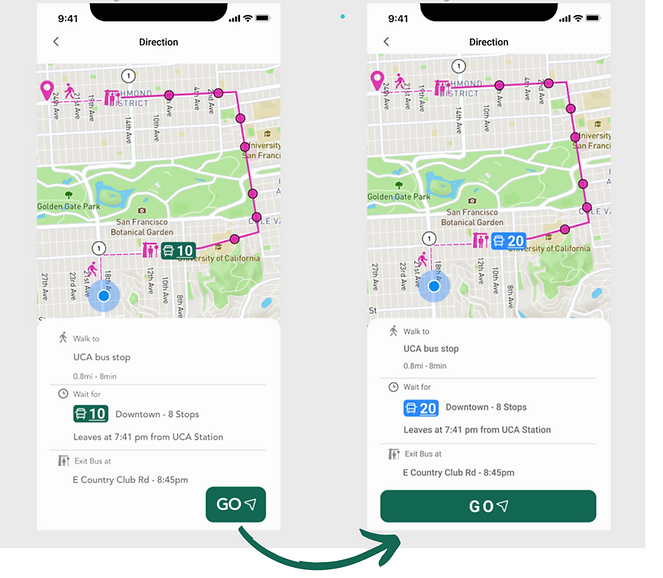
#3 Changed the height of the rectangle from 25px to 35px

Part 5: Reflection

What I Learned
The biggest lesson I learned here was accessibility. After creating different versions, I learned that consistency in design (size and color) is very important to make the design acceptable to any user. I also learned about the importance of keeping focus and sticking to the MVP when is necessary to guide the project. More features can always be added later on. I believe that everything I learned during this project can and will be applied to future and bigger projects.

Next Steps
Since this was my first UX project, I wanted to create a simple solution with the minimum amount of functionality that users would need, so I referenced user research and solutions. With a little more time, I'd like to add a "Pay Fare" feature to make it easier for users to check bus times and pay their fares using only the Bus Buddy app.